Heading content
About Project
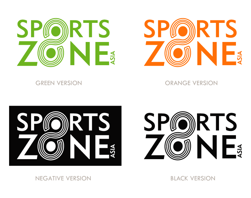
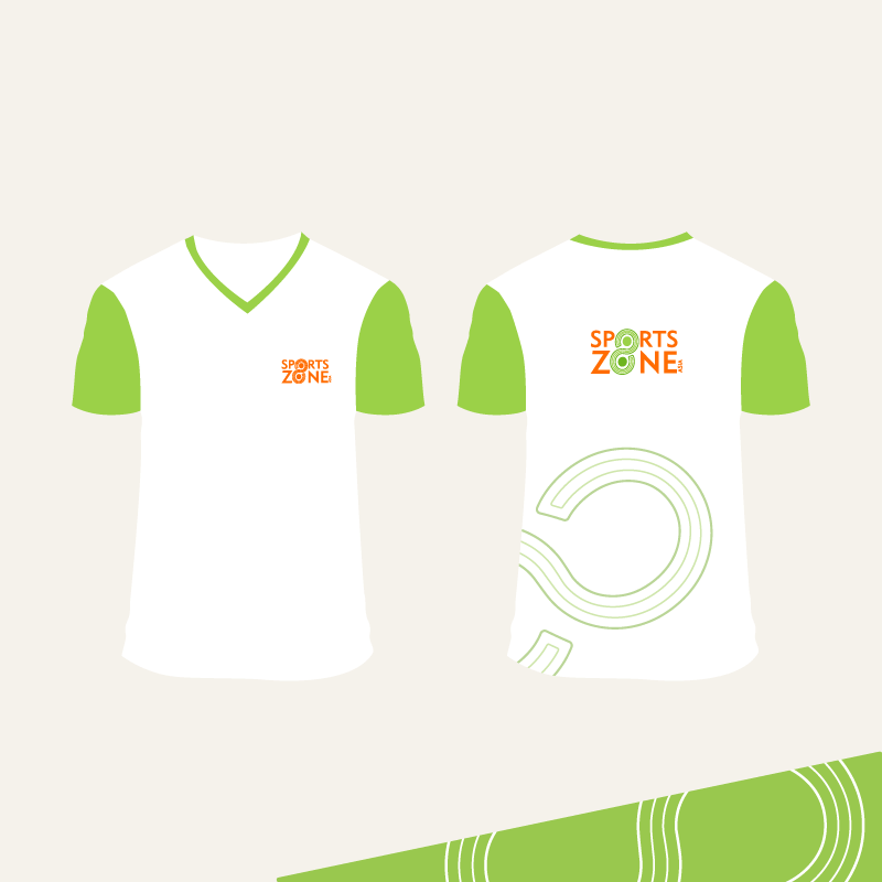
A dynamic redesign aimed at transforming a training institute for children's track and field into a more prestigious and kid-friendly brand. The logo cleverly integrates the element of '8' within the 'O's of both 'Sports' and 'Zone', simulating a track field. This thoughtful design not only elevates SportZone's appearance but also ensures it remains recognizable and appealing to its young athletes, perfectly balancing professionalism with playfulness.
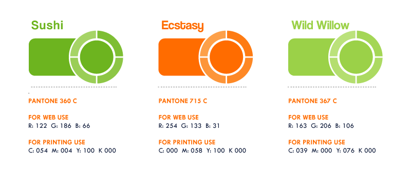
Brand Colors
© 2024 Sahil Malhan